Practicing letters can be fun and increase your skills, but eventually you will want to apply those skills to a finished work of calligraphy.
There are no specific rules regarding calligraphy page layouts; however when deciding how to arrange lettering on a page, it is helpful to understand and apply Design Elements and Principles that can make even a few words look visually interesting and convey meaning – even a simple alphabet can become a visual expression.
A couple of excellent examples of how a few words and phrases can be turned into works of art by applying basic Design Elements and Principles are the works of artists/calligraphers Alice Young and Martin Jackson.
The basics of formatting a simple page layout can be a great starting point whether you are lettering a couple of lines for a quote, a certificate, a book, or whatever words capture your interest. The following layout can be found in most calligraphy “how to” books – the single page example is based on the layout in Pen Lettering by Ann Camp.
Simple page layout
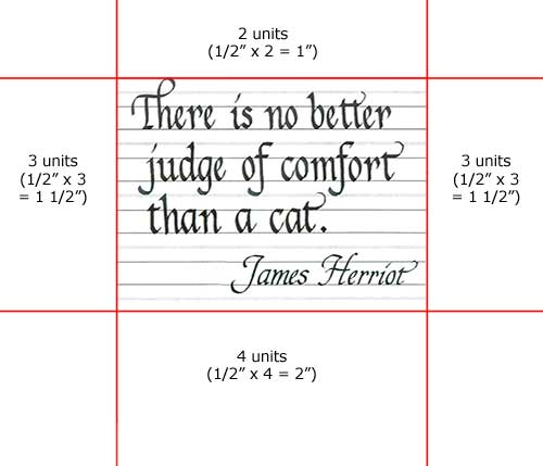
The layout is based on the “roots” of calligraphy found in medieval manuscripts or books. The proportions and margin calculations provide a simple method of obtaining balance to a lettering project. Generally, we want the following margin proportions (although there are minor variations):
- 2 units for the top margin
- 3 units for the left and right margins (some sources use 2 or 2 1/2 units)
- 4 units for the bottom margin
A unit can be any measurement – in inches, centimeters, etc. – depending on the scale of the work and how much space you decide you need around the lettering. I prefer rather generous margins around lettering as margins that are too small give a “cramped” look to the overall page.

Sample Page Layout with 1/2" Units
A few points to consider when creating a project:
- length of the text and weight (thickness) of the lettering
- do you want to include a border, drawing or other illustrations?
- standard sized paper (e.g. 8 x 10, 11 x 14) or any size?
- type and quality paper (paper won’t “yellow” over time)?
- is the finished work to be framed?
Single Page
What you need:
- a quote or a few lines of lettering
- pencil
- ruler
- paper for the finished work
- scrap paper
Step 1:
Write out your text on graph paper or guidelines to determine the style and size of lettering you want, and how you want to break up the lines.
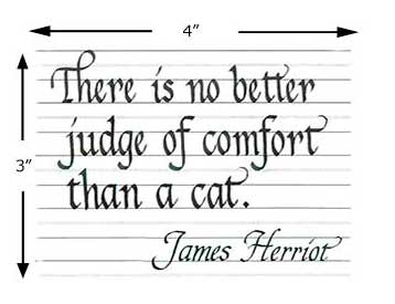
The quote I am using for this example is one of my favorites from author James Herriot:

Sample Text
The rough draft was executed using a Rotring Calligraphy Art Pen (1.9 mm) on generated guidelines from Scribblers. I decided to use a compressed Italic letter style for the main text and a slanted variation for the author’s name.
Tip: If you use a quote, don’t forget to include and acknowledge the author.
Step 2:
Now that we have an idea of the space required for the text, we can calculate the size of the margins. First, measure the length and width of the lettering. The example measures approximately 4″ x 3″.

Text Size
Step 3:
As the quote is fairly short and does not require huge margins, I chose 1/2″ as my basic unit:
- 2 units x 1/2″ = 1″ top margin
- 3 units x 1/2″ = 1 1/2″ left and right margins
- 4 units x 1/2″ = 2″ bottom margin
Adding the margins around the lettering:

Unit Margin Measures
The final paper size I would need for this quote is 6″ x 7″. All that is left to do is pencil in the guidelines and complete the lettering!
Tip: If your finished project is going to be framed, add at least an extra 1/4″ or 1/2″ around all the sides – your framer will thank you! It is much easier to trim a little extra off a page for framing than to try fitting a mat and frame around a work with tiny margins!
When we have a fixed size of paper for our project, it is easy to determine the space available for lettering, and we can make necessary adjustments to the letter size and weight by changing the nib size, break up the lines differently, or do something creative.
Let’s assume that we want to letter our project on a piece of 8″ x 10″ paper. Since our quote measures 4″ x 3″, we can adjust the units to accommodate the larger sized paper and increase the measurement to 1″:
- 2 units x 1″ = 2″ top margin
- 2 units x 1″ = 2″ left and right margins (note that this unit was adjusted)
- 4 units x 1″ = 4″ bottom margin

8 x 10 Layout
This calculation gives us about 4″ x 4″ lettering space which give us an extra inch vertically. If we want to fill the extra space, we could re-position the quote in the vertical center, try a larger letter size, re-adjust the line breaks, or include a graphic.

Layout Quote with Graphic
In this example I’ve moved the author’s name to the bottom and included a little pen-drawn cat. Now that the draft is finished and the margins are established, it’s ready for guidelines and the final lettering.
Tip: Always sign and date your work, especially if you are just beginning with calligraphy as it is a way to track your progress and you will be amazed at how quickly you improve with practice!
Remember that this simple, single page layout is just a starting point for your calligraphy projects. Look at the works of other calligraphers and take note of the paper size, letter size, lettering position and how using other elements such as drawings, painting, color, lights and darks all work together to create unity and balance.
Be creative and don’t be afraid to experiment!