And how to decipher it!
Of course, the best way to learn calligraphy is by attending a class or workshop by an experienced calligrapher, or by joining a local calligraphy group. Check with community centers or colleges – they might run a calligraphy class or workshop if there is enough interest.
Another alternative to a “hands on” lettering class is to join an on-line calligraphy group – sometimes an expert member might be willing to look at a lettering sample and give you feedback and constructive criticism.
Until you can get to a calligraphy class or workshop you can at least get started with a calligraphy “how to” book.
Although trying to learn calligraphy with just a book is possible, it can often be frustrating when your letters look nothing like the exemplars in the book, and you just don’t know why. A book can help you begin your calligraphy journey but is not a substitute for having an expert demonstrate a pen stroke, help you troubleshoot your problems, or correct inconsistencies before they become bad habits.
That being said, how does one find a good calligraphy book for beginners? A cursory search of amazon.com lists hundreds of calligraphy “how to” books – some with excerpts to view, most without. A trip to the bookstore or local library is better, as there you can see the book in its entirety and look closely at the lettering styles and instructions.
Here are a few tips and suggestions on what to look for in a calligraphy “how to” book:
- The book is about lettering with a broad-nibbed pen.
This might seem obvious, but there are books classified under the umbrella of “calligraphy” that are constructed with a pointed nib instead of a broad nib (e.g. Spencerian and Ornamental Lettering).Script styles employ a different set of tools, techniques and constructions although pointed-nib and broad-nibbed lettering are sometimes combined in a single work such as a certificate. Some beautiful examples and techniques of these styles can be found at The International Association of Master Penmen, Engrossers and Teachers of Handwriting (IAMPETH).
Make sure the book you select is for the nib-lettering technique you want to learn!
- Lettering examples include Italic, Foundational and/or Bookhand styles.
These are the most common styles taught to beginners as they can be constructed with a consistent pen angle and contain similar strokes. In my teaching experience, Italic has been the easiest for beginners to learn as the 45° pen angle is more “natural” than, for example, an Uncial 0° pen angle. Gothic, Blackletter, Fraktur, Uncial etc. styles can be difficult if you are just beginning to learn pen angles, pen strokes and letter construction.
- Lettering examples are “formal”, not stylized.
Stylized letter forms are most often seen in “intermediate” or “advanced” calligraphy books, or calligraphy books focusing more on the art aspects of calligraphy rather than the basic techniques. Calligraphers will evolve their own style based on formal letter forms with subtle, and sometimes not so subtle changes in pen angles, slant and construction.Although these individual styles and variations can be beautiful and a source of inspiration, are not very helpful for a beginner learning basic pen strokes.
It is important to look at and examine the work of professional calligraphers – some of the best in world can be found at the Society of Scribes and Illuminators – not only to develop an understanding and appreciation of fine lettering, but also to “train your eye” to recognize good letter forms.
An example of an excellent formal calligraphy style book is Pen Lettering by Ann Camp.

Formal (top) and Stylized (bottom) Italic
- The author clearly states the materials used to create the examples, particularly the tools (calligraphy fountain pen, marker or dip pen?) pen nib (Brause? Speedball?) and most important, the nib size.
- At least a few exemplars are reproduced at actual size instead of enlarged or reduced. If you know the pen nib size that created the exemplars and they are at actual size, it can be very helpful to practice the letter forms by putting a piece of tracing paper over the letters and drawing over it with your pen if you are having problems with pen angles and stroke construction. This can be particularly helpful with serifs.
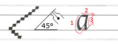
- The letter styles clearly show the pen angle, pen nib width count, and ductus.
Pen angles and proportions work together to give each letter style it’s unique characteristics. For example, an Italic pen angle can be 40° to 45° and vary in pen nib width count for ascenders and descenders. The angle and count the author used to create the exemplar is important to know when trying to re-create the letter style.The ductus shows the order, direction and count of the pen strokes. This is usually indicated by lines with arrows to show direction, and numbers to show the order.
The example below shows that the letter style has 5 pen nib widths for the x-height, 3 for the ascenders and 3 for the descenders. The pen angle is 45°, and the ductus tell us the letter “a” has 3 pen strokes and the order of their construction:

Pen Nib Widths, Pen Angle and Ductus
- Photographic examples can be helpful to see exactly how a letter is constructed, how to load a dip pen, how the pen is held, etc. Sometimes a picture is worth a thousand words!
There are many “how to” calligraphy books available and it might take a bit of searching to find one that “reads” well for you, but here are few of the “classics” to consider:
Pen Lettering, Ann Camp
Calligraphy for the Beginner, Tom Gourdie
Learning Calligraphy, Margaret Shepherd
Writing & Illuminating & Lettering, Edward Johnston – considered the “father” of modern calligraphy, this book might be a little difficult for beginners, but should be in every serious calligrapher’s library!